What Makes a Luxury Travel Website Convert
A luxury travel website usually converts by making the right visitor feel understood and reassured, not by pushing them into a form as quickly as possible. That means the page has to build confidence in the destination, the itinerary, the taste level, and the kind of service behind the offer. Conversion in this category is often a result of sequencing, not pressure. A template like Eastward is useful here because it provides one concrete version of that sequencing in practice.
Last updated: April 4, 2026
Key ideas
-
01
Luxury travel conversion is usually driven by trust and fit more than by urgency.
-
02
Destination quality, itinerary clarity, and confidence in the operator often matter before the form itself.
-
03
The best pages make the inquiry feel like the logical next step, not an interruption.
Why This Matters
Luxury travel buyers are often making a higher-consideration decision than someone booking a simpler commodity offer. They need enough proof, enough clarity, and enough confidence in the trip or service before they contact anyone. That changes what conversion means.
What to pay attention to
-
01
Itineraries often convert better when they feel specific rather than broad.
-
02
Social proof matters more when it supports fit and quality than when it is simply piled on.
-
03
A single clear inquiry path often performs better than many competing calls to action.
Eastward is the closest example on this site
This post is broader than a single template, but Eastward is the closest example here of how these ideas show up in an actual product.
View Eastward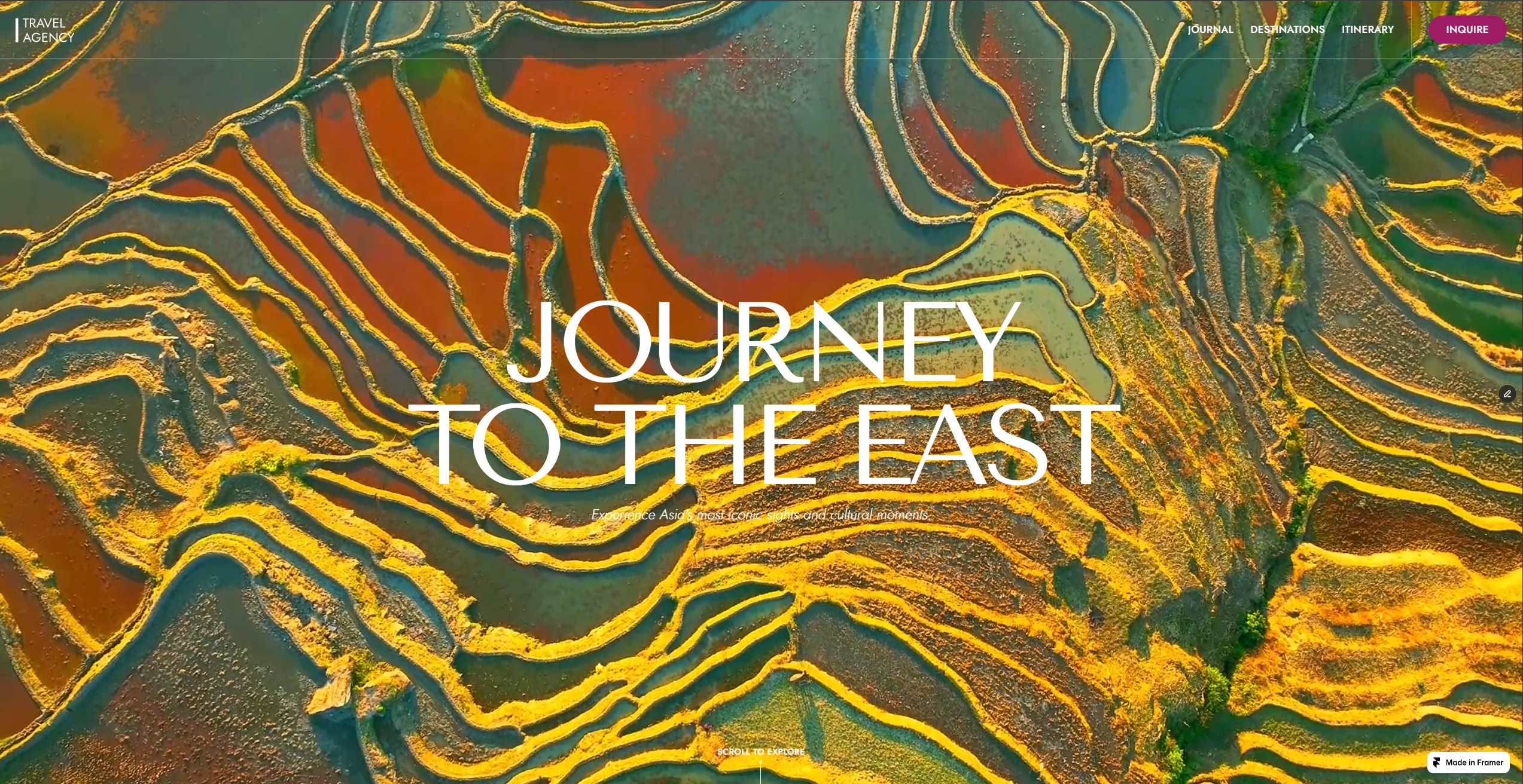
Tradeoffs
The biggest tradeoff is between selling too softly and selling too hard. If the page only creates atmosphere, the visitor may never understand the offer. If the page pushes for inquiry before enough trust exists, the lead quality often drops. Strong conversion usually comes from the middle: enough destination and itinerary proof to justify the next step.
What to Evaluate
- Review where the page asks for contact versus where it earns that contact.
- Check whether the destination and itinerary content answer the main pre-inquiry questions.
- Look at whether the calls to action are focused or scattered.
- Decide whether the page is attracting the right inquiry or just any inquiry.
The easiest way to misunderstand conversion on a luxury travel website is to treat it like conversion on a simpler ecommerce page.
On a low-consideration product, conversion can often be improved by reducing friction around a fairly straightforward decision. The visitor already understands what the product is, what it does, and roughly whether they want it. The page mostly needs to remove hesitation.
Luxury travel is different.
The visitor is not deciding whether to buy a familiar product from a familiar category. They are deciding whether a particular operator, style of journey, and level of service feel credible enough to begin a conversation with.
That means conversion starts earlier than the form.
Conversion begins with fit, not urgency
Many travel sites still act as if the main challenge is getting the visitor to act faster.
That is often the wrong diagnosis.
For a premium or selective travel offer, the bigger challenge is usually helping the right visitor feel enough fit and confidence to act at all. If the site tries to accelerate the decision before fit is clear, it may increase friction rather than reduce it.
That is why strong luxury travel websites tend to convert through sequencing, not pressure.
They do not open by insisting on the inquiry. They open by making the offer understandable.
Trust does more work than the form
The form matters, but it is rarely where the main persuasion happens.
By the time a qualified visitor reaches out, several things usually need to have happened first:
- the destination quality needs to feel credible
- the itinerary style needs to feel aligned with their taste
- the operator needs to seem worth contacting
- the site needs to make the process feel considered rather than chaotic
If those conditions are not met, changing the button color or moving the CTA higher will not solve the real problem.
This is one reason I find Eastward useful as a reference. The site does not rely on a single forceful conversion element. It builds a case across the page.
Specificity usually converts better than breadth
A common mistake in travel marketing is to assume that broader promise equals broader appeal.
In practice, vague breadth often weakens conversion. The visitor sees many destinations, many claims, many possibilities, but not enough evidence of how the brand actually thinks or what the experience really looks like.
Specificity works better.
Specific itinerary structure, specific travel pacing, specific brand positioning, and specific cues about who the offer is for all reduce ambiguity. They help the visitor place the offer correctly in their mind.
That is especially important in a premium category. People are not paying for “travel” in the abstract. They are paying for a point of view, a level of access, and a particular standard of judgment.
Itineraries often do more conversion work than brand copy
Brand copy is important, but it can only carry so much weight by itself.
At some point, the visitor needs to see what the service becomes when it stops being positioning and starts becoming a trip.
That is where itineraries matter so much.
They make the offer legible.
They show:
- how the journey is paced
- whether the brand feels generic or selective
- whether the experience seems thoughtful
- how much confidence the operator seems to have in its own product
This is why sites with beautiful branding and weak itinerary content often underperform. The design creates interest, but the visitor never gets enough evidence to justify the next step.
Social proof matters most when it supports fit
Social proof on a luxury travel site should not feel like a pile of generic reassurance.
The strongest proof is the kind that helps the visitor think, “People like me would trust this.”
That can come from testimonials, editorial content, brand history, visible expertise, or even from the tone and specificity of the site itself. The point is not just to prove that someone, somewhere, liked the service. The point is to reinforce the feeling that the offer is real, coherent, and intended for a certain kind of buyer.
That is a more useful standard than simply asking whether the site has enough testimonials.
The CTA should arrive after the page has earned it
Luxury travel sites still need to ask for inquiry clearly. The issue is timing and context.
If the CTA appears before the visitor understands the offer, it feels transactional in the wrong way.
If it appears after the site has created enough confidence, it feels natural.
That is why I generally prefer a single clear inquiry path over many scattered prompts competing with each other. Too many calls to action can make a premium offer feel anxious. A more focused path often feels more controlled, which is itself a trust signal.
This does not mean the site should hide the next step. It means the next step should appear inside a page that has already done the work of clarifying what the visitor is stepping toward.
What usually weakens conversion
When luxury travel pages underperform, the problem is often one of four things.
First, the site creates atmosphere without enough interpretation.
Second, it shows too much without enough selection.
Third, it asks for inquiry before the service feels concrete.
Fourth, it speaks in generic luxury language where the visitor needs evidence and structure.
Those are all versions of the same issue: the page has not built enough confidence in the offer before asking for trust.
A better definition of conversion for luxury travel
I would define conversion on a luxury travel website like this:
The page converts when it makes the right visitor feel that inquiry is the logical next step.
That definition is important because it changes how the site should be designed and evaluated.
It pushes attention toward:
- better sequencing
- stronger itinerary content
- more selective destination framing
- clearer positioning
- fewer, more coherent CTAs
That is a more realistic model than treating conversion as a matter of increasing urgency.
The practical takeaway
What makes a luxury travel website convert is not one feature.
It is the combination of trust, specificity, taste, and sequence. The best pages help the visitor understand the offer, believe in the operator, picture the experience, and feel comfortable enough to start the conversation.
That is why conversion in this category is usually earned rather than forced.
Questions
What usually drives conversion on a luxury travel site?
Usually trust, itinerary clarity, destination quality, and confidence in the service model. The form matters, but it is rarely the first thing doing the work.
Should a luxury travel site ask for inquiry early?
Only after enough context exists. In this category, trust usually needs to be earned before the call to action feels natural.
Can fewer calls to action convert better?
Yes. A more focused inquiry path often works better than several competing prompts scattered across the page.
Related Pages
Nearby Topics
These posts cover adjacent questions around trust, positioning, and page structure.
How Conversion Works on a Luxury Travel Site
A practical guide to how luxury travel websites turn trust, itinerary clarity, and positioning into better inquiries.
Luxury Travel Website Design
Guide to what makes luxury travel website design feel credible, selective, and worth inquiring through.
Luxury Travel Website Examples
Guide to what to look for in luxury travel website examples, including structure, pacing, and how good travel sites build trust.
Notes
- Last updated: April 4, 2026.
- Template references reflect the current Eastward page on this site.
Stay ahead of
the curve.
Get latest updates about my new drops and important information for existing customers. No promotion or ads.