Luxury Travel Website Design
Luxury travel website design is less about decorative polish than it is about controlled presentation. The site has to make a premium trip, destination, or planning service feel coherent before the visitor has all the details. That usually comes down to pacing, image use, destination hierarchy, and how the inquiry path is introduced. Eastward is a useful example because it already translates some of those choices into a concrete travel template rather than leaving them at the level of abstract advice.
Last updated: April 4, 2026
Key ideas
-
01
Luxury travel website design depends more on control and hierarchy than on ornament.
-
02
The strongest sites introduce destinations, itineraries, and inquiry flow in a deliberate sequence.
-
03
A template can embody some of these decisions, but the underlying principle is broader than any single product.
Why This Matters
Luxury travel is a trust-heavy category. The visitor usually needs to feel the quality of the offer before they are ready to contact anyone. That means the website has to do more than look refined. It has to structure information in a way that supports confidence and fit.
What to pay attention to
-
01
Destination pages should feel selective, not overloaded.
-
02
Itineraries often do more selling work than generic marketing copy.
-
03
The inquiry path should feel intentional rather than pushed too early.
Eastward is the closest example on this site
This post is broader than a single template, but Eastward is the closest example here of how these ideas show up in an actual product.
View Eastward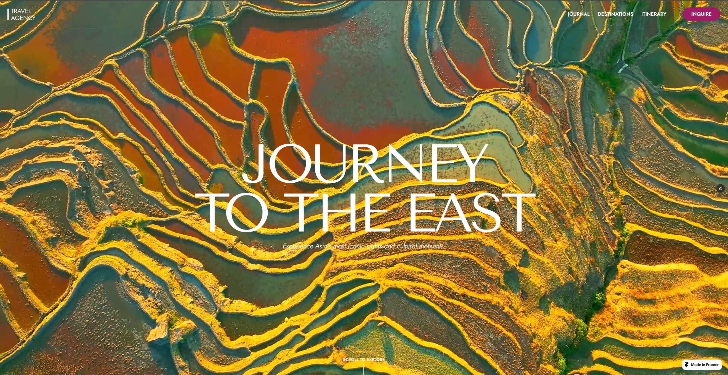
Tradeoffs
The main tradeoff is between expressive presentation and commercial clarity. Too much atmosphere can make the offer vague. Too much operational detail too early can flatten the sense of value. The best luxury travel websites balance both without collapsing into either a booking engine or a mood board.
What to Evaluate
- Look at where the site introduces the offer versus where it introduces the inquiry.
- Check whether the destinations and itineraries are doing enough explanatory work.
- Review whether the visual system supports trust or just surface polish.
- Decide whether the site feels selective or merely expensive.
Luxury travel website design is usually misunderstood.
People talk about it as if it were mainly an aesthetic style: elegant typography, spacious layouts, strong photography, muted color palettes, and fewer obvious sales elements. Those things can help, but they are not the center of the job.
The real job is interpretation.
A good luxury travel website helps the visitor understand what kind of experience is being offered, what level of discernment sits behind it, and whether the operator feels worth contacting. If the design cannot do that, the site may look expensive without feeling convincing.
Luxury design is not the same thing as expensive-looking design
There is a big difference between a site that feels premium and a site that merely borrows premium signals.
Expensive-looking sites usually rely on familiar cues:
- oversized imagery
- elegant fonts
- lots of whitespace
- slow pacing
- abstract copy
Sometimes that is enough to create surface polish. It is not enough to create trust.
Premium travel buyers are not only reacting to visual taste. They are evaluating whether the site seems selective, coherent, and credible. They want to feel that the brand knows how to choose, not just how to decorate.
That is why I think strong luxury travel design depends more on control than on ornament.
Control of what appears first.
Control of what gets emphasized.
Control of how destinations, itineraries, and inquiry prompts are introduced.
Control of when the visitor is asked to act.
The strongest sites use hierarchy to create confidence
Hierarchy is one of the clearest differences between a premium travel site and a generic one.
On weaker sites, everything competes with everything else. There are too many destinations, too many image styles, too many buttons, too many ideas in the hero, and too much copy that sounds polished without saying much. The result is visual noise with premium styling laid over it.
On stronger sites, the visitor knows where to look and what to understand next.
The site introduces the brand, then the travel style, then the kinds of destinations or itineraries that make the promise believable, then the next step.
That sequence matters because luxury travel is still a selling environment. The design is not there simply to create atmosphere. It is there to support interpretation and trust.
Destination presentation should feel selective
One of the fastest ways to weaken a travel site is to overload destination content.
That usually happens when the site tries to prove range by showing too much at once. The logic seems sound: more destinations, more options, more reasons to inquire. In practice, it often has the opposite effect. The site stops feeling curated and starts feeling inventory-led.
Selective destination presentation does more persuasive work.
It tells the visitor:
- these people know what they are featuring
- the offer has edges
- there is editorial judgment behind the brand
- I am not looking at a generic catalog
This is one reason Eastward works as a useful reference. Its positioning and content architecture suggest depth over sprawl. Even before you get into the details, the design language implies that not everything is being shown at equal weight.
That is important. Luxury is rarely communicated through abundance alone. More often, it is communicated through selection.
Itineraries usually do more selling work than brand copy
A lot of travel homepages and service pages put too much pressure on general brand language.
They talk about bespoke planning, unforgettable experiences, seamless service, cultural depth, or elevated journeys. None of that is necessarily wrong. It is just not enough by itself.
The visitor eventually needs to see what the offer looks like when it becomes concrete.
That is why itinerary design matters so much. Itineraries are where the promise stops being atmospheric and starts becoming legible. They show pace, structure, tone, and level of intention. They answer the question a visitor is often asking underneath everything else: what would traveling with these people actually feel like?
When itinerary content is strong, it reduces dependence on generic luxury vocabulary. The site no longer needs to insist that the experience is thoughtful. It can show the thoughtfulness directly.
The inquiry path should feel deliberate
One of the biggest mistakes in luxury travel website design is treating conversion elements as if they belong in the same relationship to the visitor as they would on a lower-consideration product page.
On a simpler site, the right answer may be to push the form or booking CTA quickly and repeatedly. On a premium travel site, that can backfire if the visitor has not yet decided that the operator is worth contacting.
The inquiry path still needs to be visible. It just should not feel disconnected from the rest of the page.
The strongest sites make contact feel like a natural extension of the journey the visitor has already taken through the content. That means:
- the CTA appears after enough context exists
- the page explains the offer before it asks for commitment
- the surrounding content reduces uncertainty
- the tone of the call to action matches the tone of the brand
The problem is not that sites ask for inquiry. The problem is that many ask before they have earned it.
Good luxury design balances atmosphere and clarity
There is a real tradeoff here.
If the site is too atmospheric, the offer becomes blurry. The visitor may admire the brand without understanding it.
If the site is too operational too early, the sense of value can collapse. The brand may become legible, but ordinary.
The best luxury travel websites sit in the middle. They preserve mood, pacing, and editorial control while still making the commercial logic clear.
That is why I would not evaluate luxury travel website design mainly through the question, “Does it look premium?”
A better question is, “Does the site make the offer feel precise?”
Precision is what separates a premium presentation from an expensive-looking one.
What to study when reviewing a luxury travel site
If I were reviewing a luxury travel website design seriously, I would focus on a few things.
First, how quickly does the site establish a specific point of view?
Second, do the destinations and itineraries feel chosen, or simply listed?
Third, does the site rely on abstract language where concrete structure should be doing the work?
Fourth, when the page asks for inquiry, has it already answered the main pre-contact questions?
Fifth, does the site feel like a coherent world, or like a set of attractive blocks assembled without enough editorial judgment?
Those are the questions that reveal whether the design is actually helping the business.
The practical takeaway
Luxury travel website design is not a decorative layer added after the strategy is done.
It is part of the strategy.
It determines how the visitor reads the brand, how they interpret the destinations, how they understand the trip style, and whether contacting the operator feels justified.
When the design is doing that job well, the site feels premium because it feels controlled, specific, and believable.
That is a much higher standard than looking refined.
Questions
What makes a luxury travel website feel premium?
Usually stronger hierarchy, more selective pacing, better destination presentation, and an inquiry path that feels deliberate rather than rushed.
Do luxury travel websites need a large site map?
Not always. Some of the strongest ones are more controlled and selective, with fewer pages doing clearer work.
Can a template support luxury travel website design?
Yes, if the template already understands travel-specific structure. The principle is not whether it is custom or templated, but whether the hierarchy and pacing support trust.
Related Pages
Nearby Topics
These posts cover adjacent questions around trust, positioning, and page structure.
Luxury Travel Website Examples
Guide to what to look for in luxury travel website examples, including structure, pacing, and how good travel sites build trust.
What Makes a Luxury Travel Website Convert
Guide to the structural and trust-building decisions that help a luxury travel website turn the right visitors into inquiries.
How Conversion Works on a Luxury Travel Site
A practical guide to how luxury travel websites turn trust, itinerary clarity, and positioning into better inquiries.
Notes
- Last updated: April 4, 2026.
- Eastward references reflect the current local template data on this site.
Stay ahead of
the curve.
Get latest updates about my new drops and important information for existing customers. No promotion or ads.