How Conversion Works on a Luxury Travel Site
Conversion on a luxury travel site usually does not come from pushing the visitor toward a form faster. It comes from making a selective offer feel legible and worth inquiring about. The site has to establish what kind of travel is being sold, what level of taste or access sits behind it, and what the inquiry is actually for. That sequence matters more here than it does on simpler booking flows. Eastward is one useful example of that pattern, but the underlying conversion logic is broader than any one homepage.
Last updated: April 4, 2026
Key ideas
-
01
Luxury travel conversion usually starts before the form, with positioning, interpretation, and trust.
-
02
The strongest sites move from intrigue to clarity to proof instead of asking for inquiry too early.
-
03
Better conversion in this category often means better-fit inquiries, not just more clicks.
Why This Matters
A luxury travel site is often selling a higher-consideration decision than a standard booking flow. The visitor is evaluating taste, fit, credibility, and the likely quality of the trip before they decide whether contacting the operator is worth the effort. That means conversion depends heavily on sequencing. If the site asks for action before enough confidence exists, it can reduce both response and lead quality.
What to pay attention to
-
01
The opening sections should create interest without leaving the offer vague.
-
02
Positioning has to translate atmosphere into a usable mental model of what kind of trip or service is being sold.
-
03
Itinerary, destination, and experience content often do more conversion work than generic luxury copy.
-
04
Proof works best once the visitor understands the category, price level, and service model they are evaluating.
-
05
The inquiry path should feel like the logical next step for the right prospect, not a demand dropped into an unclear page.
Eastward is the closest example on this site
This post is broader than a single template, but Eastward is the closest example here of how these ideas show up in an actual product.
View Eastward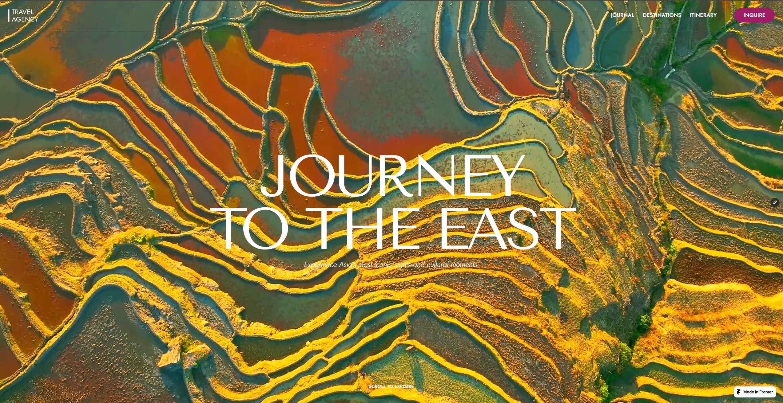
Tradeoffs
The core tradeoff is qualification versus speed. A more interpretive luxury travel site can feel slower than a booking-first travel page because it spends more room on framing, destination context, and proof. That is often the right trade when the offer is selective, bespoke, or high-consideration. It is less useful when the business depends on fast transactions, standardized packages, or price-led comparison.
What to Evaluate
- Review whether the first screen creates interest while still signaling what category of travel or service the visitor is entering.
- Check whether the page explains the trip style before asking for a major commitment.
- Look at whether destination and itinerary sections are clarifying the offer or just decorating it.
- Notice whether trust signals appear in the right order, after the visitor has context to interpret them.
- Decide whether your site should optimize for maximum click volume or for better-fit inquiries.
- Evaluate whether the inquiry CTA feels earned by the page or isolated from the page.
Most conversion advice breaks down once the site is selling a more selective kind of travel.
The usual advice assumes the visitor already understands the offer and mostly needs less friction. That can work for commodity bookings or standardized packages. It does not explain how a luxury travel site earns inquiry when the visitor is still deciding what kind of operator this is, whether the taste level feels credible, and whether contacting the brand will be worth their time.
That is why I think luxury travel conversion is usually better understood as a sequence problem than a button problem.
The site has to help the visitor move through a few decisions in order:
- Is this interesting enough to keep reading?
- What kind of trip or service is this, exactly?
- Do I trust the people behind it?
- Does the offer feel strong enough to justify an inquiry?
If those questions are answered well, the form becomes much easier. If they are answered badly, no CTA placement trick will do much to fix it.
Conversion starts before the form
On a luxury travel site, the inquiry is not the first meaningful action. The first meaningful action is interpretation.
Before someone fills out a form, they have to understand what they are looking at. Is this a bespoke trip planner, a specialist operator, a destination-focused editorial brand, or a dressed-up generic agency? Does the site suggest discernment, or just surface polish? Is the offer likely to be relevant to the kind of travel they want?
Those are conversion questions even though they happen well before the CTA.
This is why many premium travel sites underperform despite looking refined. They may have strong imagery, strong typography, and a generally expensive feel, but they do not make the offer clear enough soon enough. The visitor is left with mood instead of a usable mental model.
A useful framework: intrigue, interpretation, proof, inquiry
The cleanest framework I know for this category is:
- Intrigue
- Interpretation
- Proof
- Inquiry
The first stage earns attention.
The second stage tells the visitor how to read the offer.
The third stage shows that the positioning is real.
The fourth stage asks for action once the page has made that action feel reasonable.
That does not mean every site needs a slow cinematic homepage. It means the page has to do these jobs somehow, and in roughly this order, if the offer is high-consideration.
Intrigue matters, but only if it stays controlled
Luxury travel usually benefits from a degree of atmosphere. The product is partly experiential, so the site has to create some emotional orientation before it can explain itself in full.
But the goal of the opening is not decorative beauty for its own sake. The goal is to create interest without turning the offer into a mystery.
That is the line many sites miss. They produce an elegant hero, but the visitor still cannot tell whether the brand is selling private journeys, broad travel planning, fixed departures, destination curation, or something else entirely.
Controlled intrigue works when the visitor thinks, “I want to understand this better.”
Uncontrolled intrigue fails when the visitor thinks, “This looks nice, but I still do not know what I am being asked to care about.”
Interpretation is where many travel sites actually win or lose
Once the page has attention, it has to convert mood into meaning.
This is where positioning lines, service framing, and category cues matter more than generic luxury copy. The visitor needs to grasp the trip style, the level of selectivity, and the likely service model. A phrase like “privately guided” or “deeply curated” is not useful because it sounds premium. It is useful because it helps narrow the visitor’s interpretation of the offer.
That interpretive step is one of the main reasons Eastward works as a reference point. It does not just look editorial. It gives the visitor a stronger frame for what kind of travel is being sold and what kind of traveler it is for.
The broader lesson is not “copy Eastward.” The broader lesson is that a luxury travel site has to explain its point of view before the inquiry asks the visitor to commit to anything.
Proof should arrive after the offer makes sense
Proof is much more persuasive once the visitor knows what is being proven.
This is an ordering issue. Experience, access, discretion, destination knowledge, itinerary examples, press mentions, or client signals all work better after the visitor has a clear enough model of the offer. Otherwise the page is asking proof to carry the full burden of persuasion on its own.
That is why itinerary previews and destination depth often outperform broader marketing claims in this category. They show what the service actually looks like. They make the operator’s judgment more visible. They reduce the gap between the brand promise and the likely trip experience.
In many luxury travel sites, the strongest proof is not a testimonial block. It is a page structure that makes the service feel concrete.
Inquiry works best when it feels earned
A form is not persuasive just because it is prominent.
On a luxury travel site, inquiry usually performs better when the CTA appears after the visitor has enough clarity to imagine what the conversation will be about. By that point, the form no longer feels like a demand for trust. It feels like the next step in a process the visitor already understands.
That distinction matters because premium travel prospects are often filtering the operator as much as the operator is filtering them. They do not only want a trip. They want confidence that the time they spend reaching out will lead somewhere worthwhile.
If the site cannot create that confidence, a harder CTA often just creates more friction.
Better conversion often means better-fit inquiries
This is the part many CRO discussions flatten.
For a selective travel brand, the goal is not necessarily to maximize raw response. The more useful goal is often to increase the number of inquiries that match the offer, the price level, and the service model.
That changes how you judge a page.
You may accept a slightly longer reading path if it qualifies better.
You may spend more space on destinations or itineraries if they improve fit.
You may avoid aggressive urgency if it attracts the wrong kind of lead.
In that sense, conversion on a luxury travel site is often inseparable from positioning. A page that qualifies better can be a better converting page even if it generates fewer total clicks.
Where Eastward fits into this
Eastward is useful because it shows one concrete version of this sequence in practice.
It uses atmosphere early, then narrows the interpretation of the offer, then adds credibility and itinerary context, then makes inquiry feel more natural. That is a strong structure for a selective travel product.
But the article is not really about Eastward. It is about the broader pattern that Eastward happens to illustrate well.
If your travel site depends on taste, trust, and a more considered buying decision, the same logic applies even if your layout, visual language, and CTA structure look completely different.
The practical test
If you want to evaluate whether a luxury travel site is set up to convert well, ask:
- Does the opening create interest without hiding the offer?
- Does the page explain what kind of travel is being sold before it pushes for action?
- Do destinations, itineraries, or experience sections make the offer more concrete?
- Do proof elements appear after the visitor has enough context to interpret them?
- Does the inquiry feel like the natural next step for the right prospect?
If the answer is mostly yes, the site is probably doing real conversion work.
If the answer is mostly no, the problem is unlikely to be just button color, CTA wording, or form length.
The takeaway
Luxury travel conversion usually works by building belief in the offer before it asks for commitment.
That belief is built through sequence: interest first, interpretation second, proof third, inquiry last.
The site does not need to be quiet or editorial to follow that model. It just needs to make the right things believable in the right order.
That is the difference between a page that looks premium and a page that actually earns inquiry.
Questions
What usually drives conversion on a luxury travel site?
Usually a mix of clear positioning, itinerary or destination credibility, trust in the operator, and an inquiry path that appears after enough confidence has been built.
Should a luxury travel site ask for inquiry immediately?
Not always. If the offer is selective or high-consideration, the visitor often needs more context before the inquiry feels worth making.
What content tends to do the most conversion work?
Often the content that makes the trip legible: destination pages, itinerary previews, experience framing, and proof that the operator can deliver what the positioning promises.
Is this only relevant for custom travel planners?
No, but it is most relevant for offers where trust, fit, and presentation matter more than instant booking speed.
Related Pages
Nearby Topics
These posts cover adjacent questions around trust, positioning, and page structure.
What Makes a Luxury Travel Website Convert
Guide to the structural and trust-building decisions that help a luxury travel website turn the right visitors into inquiries.
Luxury Travel Website Design
Guide to what makes luxury travel website design feel credible, selective, and worth inquiring through.
Luxury Travel Website Examples
Guide to what to look for in luxury travel website examples, including structure, pacing, and how good travel sites build trust.
Notes
- Last updated: April 4, 2026.
- Examples reflect the current Eastward template and the surrounding luxury travel content on this site.
- Specific page structures vary by operator, but the sequencing principles here are most relevant to selective or premium travel offers.
Stay ahead of
the curve.
Get latest updates about my new drops and important information for existing customers. No promotion or ads.